Oulu City Brand
A Higher Degree of Ouluness
Oulu’s City Brand
Oulu’s City Brand leans on three central pillars: Northern, Humane and Smart
The citizens of Oulu participated in the creation of the brand. Each act, idea, response, comment and piece of feedback have guided the brand towards a Higher Degree of Ouluness. Oulu’s City Brand was published in 2021.
The Brand Book guides how to express Oulu in pictures and words. The handbook presents the most important matters of the brand, guides the design of messaging and communication and guides the use of visual material.
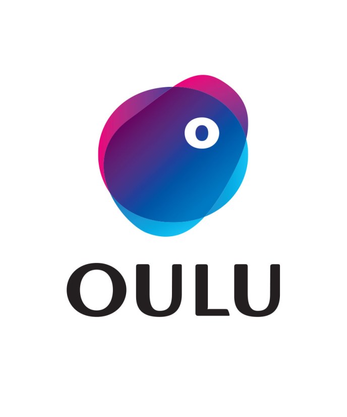
Oulu’s Logo
Oulu’s logo combines the old and new. The familiar and unique shade of purple has found a coastal blue at its side. Together they form a gradient that represents Oulu’s different sides and contrasts. When the color is put together with the word ‘Oulu’ with the familiar typography, Oulu’s City Logo is born: unique, familiar, fresh and so very Oulu.
The basis of the entire logo is the letter O of the word ‘Oulu’. O has given its shape to the logo’s elliptical general shape and the degree sign present in the logo. They come together with the organic and malleable shape that lives on top of the ellipsis: when the world changes, so does Oulu.

Colors of Oulu
Oulu’s colors are fresh. Oulu’s familiar shade of purple is connected with a melodious, coastal blue as well as the gradient of the combined colors. In order to create the gradient, a binary hue is needed to ensure the color’s brightness. The binary hue is also a part of Oulu’s colors.

Typography
A title font has been designed for Oulu, Oulun Graadi. It is the font of Oulu’s people with a higher degree of relaxed nature. The font has a slight tinge of variation in thickness and slanted letter margins just as in the Oulu logo. Instead of straight diagonal lines, there are flat wide curves, and the tight inner corners open in a tiny smile. The font’s unique shapes are warm, abundant and humane. The insightfully coordinated, slanted shapes make the font lively and unique.
Oulun Graadi is a font used in titles. The font used in body texts is Barlow (Install the Barlow Font from the Google Fonts Service). The secondary font used is Segoe UI, which is used, for example, in Microsoft Office Programs such as Word and PowerPoint. Cyrillic lettering is presented with the font Frutiger Neue.

Oulu’s Brand Music and Audio Logo
In the heart of the city of Oulu’s audio brand are matters typical to Oulu, such as the power of opposites, humane energy, northern strength, boldness, fairness and responsibility. All of these have been included in Oulu’s brand music which combines organic, natural sounds with a modern, technological audio environment.
Brand music and the audio logo can be used in all Oulu’s marketing communications, presentation videos, events and occasions. Different versions of the music can be made for different needs.